 Question:
“Recently, some relatives of mine went to Italy, and one of them found, much to his annoyance, that his partner always wanted to read each and every label for the paintings and sculptures in the museums. He just wanted to look at the art. What’s your advice on reading artwork labels?”
Answer:
As with many things in art and life, as they say, there’s more than one way to skin a cat. Hold on a minute, why do they say that? I would think there is only one way to skin a cat – don’t! – leave the poor creature alone!
Anyhow. Some people, like me, like to quickly scan an exhibition, then pick and choose artworks to dwell on. Others proceed methodically from one work to the next. There are those who tend to digress and detour, and those who prefer to get straight to the point. The point being that there’s more than one way to look at art, and even the same person might employ diverse and different approaches, depending on the occasion. The same goes for reading wall texts, which is, of course, part of the larger experience of looking at art.
But instead of dissecting the “pros and cons” of reading or ignoring artwork labels, let’s go behind-the-scenes to look at the other side of the equation and consider the writing of these wall texts. Hopefully this can help us better understand their function and purpose.
An excellent guide to writing gallery wall texts is produced by the Victoria and Albert Museum. Better known as the V&A, this renowned institution of art and design boasts collections which “span 5,000 years of human creativity in virtually every medium, housed in one of the finest groups of Victorian and modern buildings in Britain”. I recommend the V&A Guide not only to fellow art professionals who write or curate, but also to people who consider themselves “just audience members”.

From the onset, the V&A admit their “goal is difficult”, which is to “write gallery text that is captivating, illuminating, and comprehensible for a wide audience”. The Museum offers ten guidelines:
- Know your audience
- Write as you would speak
- Be active not passive
- Keep it short and snappy
- Organise your information
- Engage with the object
- Bring in the human element
- Sketch in the background
- Admit uncertainty
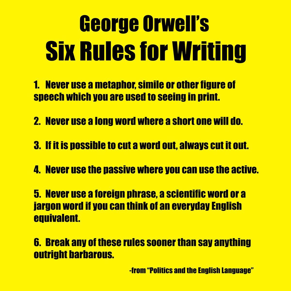
- Remember Orwell’s Six Rules
One of the things the V&A Guide does that is very helpful is compare before and after versions, where an older artwork label is updated — for instance, by using such recommendations as bringing in the human element, item 7.
For me, the one area where I wished the Guide elaborated further is item 6. Not that this section doesn’t make handful of important points, or asserts anything that I would disagree with, such as, when “helping people to appreciate the object, be careful not to rob them of the chance to make their own observations”.
But the Guide’s recommendations belie how hard it is to actually engage with an art object within the confines of a gallery label. Not only does one have only 100 or so words to provide description and context, but one also has to try and pull the viewer into the text, and by analogy, closer to the art object before them, in order to “encourage visitors to look, to understand”.
Moreover, the point I’d like to emphasise is that looking is not something we can take as given and straightforward. Yes, most children may be naturally curious, but somehow along the way, as adults many of us have lost sight of how to look attentively and closely, and with an open mind. In a previous column, which responded to the question, “how to look at an art exhibition?”, I elaborated on these issues.

Then there is item 10: George Orwell. His six rules are principles for writing with brevity and clarity, but also, very importantly, about writing mindfully and with care. What he said 70 years ago is more urgent than ever. If we shouldn’t take looking for granted, neither should we take communication. Especially in our age of the internet and social media, where there is an over-reliance on hype and clickbait, jargon and cliché, and a prevalence of mis- and dis-information. The social and political consequences of which we are only beginning to reckon with, from the United Kingdom to the United States, China to Cambodia, Russia and Rwanda.
I learned of the V&A Guide only last year, from a colleague, Rahel Joseph, Gallery Director at ILHAM. She had invited me to facilitate a writing workshop at the Gallery with the aim of producing gallery as well as catalogue texts for ILHAM’s first exhibition of its collection, Fracture/Fiction. We used the Guide as a resource during the workshop. As for the show itself, it’s been covered in Plural here and here.
As I’ve noted in this column before, over the decades, I’ve facilitated many a writing workshop. One thing that I am ambivalent about is contrasting examples of good writing with bad ones. It’s always easy to find examples of both, but in the latter case, it can feeling like you’re picking on someone and punching down. Though sometimes, the occasion may call for it.
At the beginning of the ILHAM workshop, I compared several bad examples of wall text with a few good ones. For the latter, I sought the expertise of another colleague, Russell Storer, Director (Curatorial & Collections), National Gallery Singapore. Russell has thought a lot about artwork labels, and he recommended some texts from an international exhibition on Minimalism.
As for the bad examples, my intention was precisely to highlight some local instances. In Malaysia, too often we make all this effort to put up a show, but then when it comes to the important finishing details, such as wall text, brochure or catalogue — crucial interfaces between exhibition and audience — we rush through and do a sloppy job.

I didn’t have to search very hard, and found what I needed at an important museum in Kuala Lumpur (I won’t say which one; also, the thing about gallery texts is that they are usually presented without naming their authors). Some of the labels were ungrammatical or poorly written. Others offered reductive interpretations that left little room for viewers to make their own observations.
My favourite bad example was the exhibition map. Apparently, the designer used the floor-plan without thinking how to orient it for the museum visitor. Say, for instance, you identified an installation situated on the right-side of the map, you would then have to recalibrate, because the illustration was referring to the left-side of the gallery space.
Would that our workshop at ILHAM had the luxury of more time; perhaps then we might have come closer to producing labels for Fracture/Fiction that were captivating, illuminating, and comprehensible for a wide audience. Alas, there were tight deadlines. For the most part our work was intelligible and informative, but rare was the snappily articulated paragraph, and on more than a few occasions, our writing also over-explained the art at hand. It’s hard to write good gallery texts.
I have one last point to make – a larger one about looking at art and reading about it. If, when you go see a show, you prefer just to look at the art, and not read the labels, then that’s fine, of course. But eventually, if you’re really interested in what you’ve seen, it’s important to read about it too. Contemporary art isn’t just a visual thing: it’s also about ideas and stories; it’s fundamentally discursive. And by this I mean that artworks are always embedded in larger contexts – art and social histories, ideologies and philosophies and so on.

 Question:


